
Creating a Sports Club Website Using WordPress
Thu, 01 May 2025

Follow the stories of academics and their research expeditions
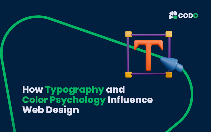
When creating a website, design is more than just making it look beautiful. It’s about sending the right message, guiding users smoothly, and building trust. Two important design elements that help achieve this are typography and color psychology. In this blog, we’ll explain how these two influence web design and improve user experience.
What Is Typography in Web Design?
Typography is the style and appearance of text. It includes the typeface (font), font size, spacing, and layout. Good typography makes content easy to read, attractive, and effective in communication.
Why Typography Matters:
• Readability: A clean, readable font keeps users engaged.
• Hierarchy: Using different font sizes and weights helps highlight important information.
• Personality: Fonts can show the tone of your brand (serious, playful, modern, or classic).
• Consistency: Using the same font styles throughout your website creates a professional and organized look.
Example:
A law firm website may use bold, serif fonts to appear serious and trustworthy, while a kid’s game site may use fun, rounded fonts to appear friendly and playful.
What Is Color Psychology?
Color psychology is the study of how colors affect feelings and behaviors. Colors can make people feel happy, calm, excited, or even hungry. In web design, choosing the right colors can influence users’ decisions and mood.
Common Colors and Their Meanings:
• Blue: Trust, calm, security – often used in tech and finance websites.
• Red: Passion, urgency, excitement – used in sales or alerts.
• Green: Growth, health, nature – good for eco or wellness brands.
• Yellow: Energy, happiness – grabs attention quickly.
• Black: Luxury, power, elegance – often used in high-end brands.
• White: Clean, simple, peaceful – used for minimal and modern designs.
Color Harmony:
Colors must work well together. A website with too many bright or clashing colors can confuse users. Designers use color palettes that create a pleasing experience and match the brand identity.
How Typography and Color Work Together
When typography and color are used properly together, they:
• Guide the user’s eyes to the right places.
• Help build brand identity and trust.
• Improve website navigation and user experience.
• Encourage visitors to stay longer and take action (click, buy, sign up, etc.).
Tips for Using Typography and Color in Web Design
1. Choose Fonts That Match Your Brand: If your brand is modern, choose sleek, sans-serif fonts. For traditional brands, serif fonts work best.
2. Use 2–3 Fonts Max: Too many fonts can confuse users.
3. Pick a Main Color and Accent Colors: Use a main color for branding and 1–2 accent colors for buttons or highlights.
4. Maintain Good Contrast: Make sure text is easy to read by using dark text on a light background or vice versa.
5. Be Consistent: Stick to the same styles and colors across all pages
Thu, 01 May 2025
Wed, 30 Apr 2025

Wed, 30 Apr 2025


Embark on an educational adventure with CODO Academy, offering an extensive range of courses across diverse subjects. Whether you're a novice or a seasoned learner, our affordable courses are designed to fit your schedule and enhance your expertise. Dive into the world of knowledge and elevate your skills like never before!
Leave a comment