
Creating a Sports Club Website Using WordPress
Thu, 01 May 2025

Follow the stories of academics and their research expeditions
In today’s world, most people use mobile phones to browse the internet. If your website doesn’t look good or work well on a phone, visitors may leave quickly. That’s why mobile-first web design is very important.
In this blog, we will explain how to design a mobile-friendly website that not only looks great but also converts visitors into customers.
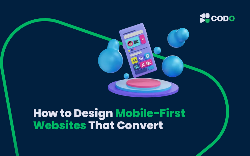
What is Mobile-First Design?
Mobile-first design means designing your website for mobile devices first, then improving it for tablets and desktops. This approach ensures that your website:
• Loads fast on mobile phones
• Looks clean and simple
• Is easy to use on small screens
Why Mobile-First Websites Matter
Here are some strong reasons to design mobile-first:
• Google loves mobile-friendly websites – it helps in SEO ranking
• Mobile users are more likely to take action (buy, sign up, contact)
• It gives a better user experience (UX) to everyone
Steps to Create a Mobile-First Website That Converts
1. Use a Responsive Layout
Make sure your website adjusts to different screen sizes using responsive design. Use tools like:
• CSS Flexbox or Grid
• Frameworks like Bootstrap
• Page builders like Elementor (for WordPress)
Keyword tip: Use keywords like “responsive web design”, “mobile-friendly layout”, and “WordPress mobile design” in your content and meta tags.
2. Keep Your Design Simple
A cluttered design confuses users. Focus on:
• Clean layout
• Big buttons
• Easy navigation
Keep only what’s necessary. Use clear headings and short texts.
3. Optimize for Speed
Speed matters on mobile. A slow site = lost customers.
Here’s how to boost speed:
• Compress images (use WebP format)
• Use fast hosting (like Hostinger or Bluehost)
• Minimize CSS, JavaScript
SEO tip: Page speed is a Google ranking factor.
4. Create Clear Call-to-Actions (CTAs)
CTAs guide your visitors. For example:
• “Call Now”
• “Buy Today”
• “Sign Up Free”
Make buttons big enough for thumbs. Place them where users can see easily without scrolling.
5. Use Mobile-Friendly Fonts
Avoid small or fancy fonts. Use readable fonts like:
• Roboto
• Open Sans
• Arial
Keep font size at least 16px for easy reading on mobile.
6. Test on Real Devices
Don’t rely only on simulators. Check your website on real phones and tablets. Try:
• iPhone and Android phones
• Different screen sizes
• Slow internet connections
7. Use SEO Best Practices
To get more visitors from search engines:
• Add relevant keywords in your titles, headings, and URLs
• Use alt text for images
• Create a fast-loading mobile sitemap
Some good keywords to include:
• mobile-first design
• responsive website
• mobile-friendly website
• improve website conversion
• web design for beginners
Final Thoughts
Designing mobile-first is no longer an option—it’s a must. A mobile-first, SEO-optimized website helps you get more traffic and better conversions. Whether you’re building your site using WordPress, Shopify, or even from scratch, always put the mobile user first.
Need help creating a mobile-friendly website without coding? Check out the 15-day Web Design Course by CODO Academy. You’ll learn everything from WordPress, ad design, SEO, and more—even if you’re a complete beginner!
Thu, 01 May 2025
Wed, 30 Apr 2025

Wed, 30 Apr 2025


Embark on an educational adventure with CODO Academy, offering an extensive range of courses across diverse subjects. Whether you're a novice or a seasoned learner, our affordable courses are designed to fit your schedule and enhance your expertise. Dive into the world of knowledge and elevate your skills like never before!
Leave a comment